Showing posts with label interior design. Show all posts

Wednesday, August 19, 2009

WALL PAPER: where more at home than in London?

Thousands of gallons later I am still a great supporter of Papers & Paints' Not Totally White. The milky emulsion allows a feeling of crisp cleanliness while preserving a hint of warmth. The perfet canvas for layers of subtle interior design. But England's tradition in wall papers is such that they never make a complete exit from the trendy magazines. The weather calls for an illusion of warmth in this country and lath & plaster walls - specially typical of London's historic houses, can always do with an extra little bit of "help". Logic is never far behind good interior design choices. So where to source your papers if you have time only for a couple of pit stops? Cole & Son (I am still waiting for a chance to use one of the Fornasetti papers). Recently I have discovered the smart and understated collections by Phillip Jeffries. Check out the linens: trendy and timeless is a difficult combination to achieve and Leo's Luxe Linens do it for me. Adding warmth in the Winter yet looking suitably fresh in the Summer, linen is a winner once again in my book.

Tuesday, March 31, 2009

TRADITIONAL DESIGN: a contemporary twist

Some clients have extremely contemporary tastes while others prefer traditional space layout, antique furniture and ornate fabrics and wall papers. One of my current jobs falls in the latter of these categories. The room I am using as an example is a traditional dining room. The following are some of the suggestions I put forward to place the client's taste for traditional full length curtains, chandeliers etc. within a more contemporary framework. A Victorian style mahogany dining table and matching chairs were previously purchased by the client and will clearly be the most prominent items of furniture in the room.

A traditional Cole & Son wall paper (dusty pink grey with silver pattern) sets the early 20th century tone.

Porta Romana's Lartigue ceiling light brings a slightly contemporary twist to the equation.


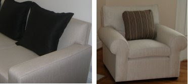
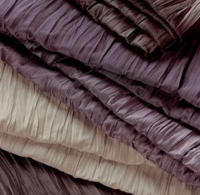
The crinkled silk like dark fabric from Villa Nova (top colourway) adds drama and sets the background for the tieback in nickel to stand out.

The Fabricant pole (gun metal paint finish, not black as shown in the picture) tilts the balance back towards a more traditional take on window dressing and so does the

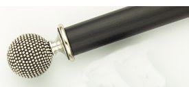
matching tieback (part of the 2009 Fabricant collection).

A possible alternative to the above

pole and tieback could have been


this Fabricant plain timber pole with

simple cap ends


and a Jason d'Souza clear tieback


Tuesday, November 04, 2008

INTERIOR DESIGN DIRECTORY

There are a few sites we refer to when we quickly need to bring up details of all suppliers or manufacturers in any given field. One of these (probably the one listing the largest number of our favourite companies) is

Wednesday, October 29, 2008

OLD FAVOURITES: clean shapes for elegant furniture

When planning furniture layouts I find helpful to create a framework of simple, solid pieces. Clean shapes and good quality are the foundation of a design which will then allow "dressing up" or "down" with accessories. Here are some old favourites, furniture and upholstery design I revisit all the time given their versatile proportions:
Dark, nearly black, stained oak furniture with modernist inspired chunky detailing and proportions

Upholstery, unless you are designing an accent piece, benefits once again from clean shapes (whether including traditional scroll arms or 20th century square detailing)


The more detailed the piece the more crucial it becomes that quality is impeccable. If budget is an issue, simple choices always pay off.

Once a framework of smart pieces of furniture has been created... colour and accessories can be added.

It's a simple recipe but one that will allow future changes without too much disruption.


Tuesday, October 21, 2008

LIMITED FURNISHING BUDGET: no limit to good taste

If you are on a limited budget, whether furnishing a first time buyer's flat or a rental investment, the golden rule has to be "keep it simple". The lower the quality the more important it is to keep detail to a minimum. Where tables and worktops are concerned thicker depths often make items look more expensive. 
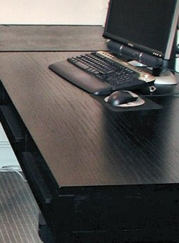
In an earlier post you saw a small kitchen designed for a rental flat. The following are some of the furnishing suggestions made for the same property. 
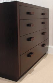
These should give an idea of how a limit on budget does not have to result in a limit on good taste. Stick to your "simplicity" rule across the board. When it comes to fabrics make plainess and budget inversely proportional: the smaller the first the plainer the second! See the board below: plain fabrics can be of a lesser quality and the difference will hardly be noticeable while patterned fabrics need to be better quality.
Compare this to a more complicated design. Take for instance one plublished months ago which included laquered side tables and a mother of pearl chest. Given the quality of those items the design was a success. On a smaller budget the lime green would probably have to be dropped and the overall number of colours decreased. The risk is that the room would otherwise look slightly amateurish.
(furniture and fabrics above, among others, from Dwell and Andrew Martin)

Saturday, October 11, 2008

ELECTRONIC PRESENTATIONS: basic cad design

A number of basic CAD programs are now available on the market. Most of them offer a reasonable alternative to those who do not need the intricacies (or the steep and lengthy learning curve) provided by AutoCad. Some of these packages come with reasonable 3D rendering built in. Usually the 3D visuals can be saved as images and therefore emailed to clients together with additional details. In other words... electronic presentations are now a reality within everybody's reach. Floor layouts, furniture, pretty much anything can be created on a laptop in a format that can then be either emailed of printed. The equivalent to traditional sketches and mood boards were, in this case, created using TurboCad and Paintshop Pro X. Below is an example which shows a standard rental flat kitchen solution together with a photograph of the suggested finishes. 
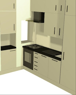
Through that sketch and photograph the client was able to agree the design and issue his instructions. 
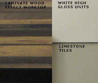
The kitchen, nearly completed, was photographed today. As you will see the simple 3D sketch was a very realistic, if simplified, visual indication of what was then actually fitted. This is now for us the standard way of making presentations, whether through printed or electronic versions of the same files.

Tuesday, August 19, 2008

LOSING THE INTERIOR DESIGN FORMULA: in the kitchen

Interior design cyclically loses it's formula. And what inspiring times those are... Periods when high street and top end of the market designs all seem to strive for the same "look" are contrasted by phases during which interior design heads in multiple directions. The quest for the holy grail, a new and original union of practical and aesthetic concerns, is momentarily open on more fronts.

After a long period during which the UK looked to its European neighbours and actually saw them, the "minimalist formula" was found. Interior design in the 90s applied this formula at every opportunity. Over the last decade however British designers' confidence has grown. Furniture, fabrics, wall papers, just about all expressions of mainstream interior design appears to be searching for a new recipe. Lines are being softened, colour is embraced, pattern is no longer to be frowned upon, every expression of design is potentially acceptable.
This lack of an apparent formula does however confirm an underlying principle which is as valid for interior design today as ever before: the talented lead the way and manufacturers follow, albeit with a delay of a decade or two.
Take kitchen design: Johnny Grey has been producing kitchens like these for the last 3 decades or so. While the price tag falls miles outside the scope of most budgets the inspiration it provides is as cutting edge as it gets. The "soft geometry", the confident colour palette, the quirky references to familial comfort, this is the stuff that 2008/2009 interior design trends are made of!

Thursday, June 05, 2008

REFURBISHMENT & RESTORATION: historical buildings in the centre of Rome

In a city such as Rome a vast proportion of refurbishments take place within historical buildings. Obiously protected by conservation laws, these buildings are also safeguarded by the inborne love of historical detail present in most Italian architects. Interestingly, in Italian the words "refurbishment" and "restoration" have virtually idential meanings and there is a single translation for both terms: "restauro". The framework of each project is set by the historical value of the structure. This however in no way limits the immagination and capacity for experimentation of some young architects. While searching for a valid example of a small scale project to demostrate the work of young Roman architects I noticed this 60 sq m space developed into a studio by a young Roman architect, Carola Vannini. Here an old store space under the arches in Piazza Vittorio (in the area of Rome known as the Esquilino) has been restored with great understanding of past, present and world trends.

Tuesday, April 29, 2008

COLOURS AND SHAPES: confident interior design

As new interior design trends emerge our level of confidence wains and, periodically, we tend to follow new, strict, unwritten rules. As we absorb and come to better understand new influences, we appear to gain the necessary confidence to break some of those rules. Over the last few years British interior design has become familiar with oriental influences, retro design, simplified structural detailing, subtler use of colour and overall cleaner lines. This new "language" of design has now become so familiar that many designers are attempting slightly richer combinations.
While leafing through an old copy of Architectural Digest (Italy, Jan 2008) I came across a photograph which illustrates this approach. Interestingly however, the project belongs to a design firm based in Brescia (Angelo Brignolli and Antonio Feraboli of Studio Linea) whose background, judging by their online portfolio, is very different to that of their UK counterparts. Most of their projects appear routed in the history of Italian architecture and furniture design and executed in conpemporary style. In the bedroom shown above the predominance of clean lines and good proportions allow the designers to play with colour and softened shapes. Ethnic influences are interpreted, not slavishly obeyed. The resulting elegance in no way forfeits comfort or warmth: an interesting example of contemporary UK design from Italian designers! There are obviously many routes one can follow to competent design...

Tuesday, May 22, 2007

DOES MY BUM LOOK BIG IN THIS? What happens when a house asks you?

You've had your first meeting with the client. The house is nice, you could do something really special with it. The budget is there, at least potentially - you're only guessing at this stage, and you would really like to do the work. Edwina (you though she was a man when she signed the initial email "Ed") is telling you how much she looks forward to working with you and then, just as you are leaving, she drops the bombshell. "Is there anything in the house you think we should get rid of? Please do tell me if you think any of my furniture would not fit in with our plan...".
You go into automatic pilot and say that you need to think it all over: you'll get back to her. As you are driving home you have your first out of body experience. Yes! The tightness in your stomach, the cold sweat, surely these belong in another body. Maybe to a rabbit caught by the headlights of a speeding Range Rover or to an inexperienced young man whose first girlfriend asks for the second* time "does my bum look big in this"?
You've asked that same question yourself many times. This feels like nemesis: serves you right! Now what do you do?
You know perfectly well that 90% of the contents of Edwina's home have got to go. You know perfectly well that if they don't she is better off not hiring you as there is nothing you could possibly do to make the house look smart. BUT IS TELLING HER
a) right for her (she really did want to know... that's why she asked) but wrong for you (the whole job is riding on this answer and you must stop being your own worst enemy)?
b) right for her (she gets an honest and unbiased opinion) and right for you (you've given yourself a fair chance, an opportunity to do a good job: if she backs off because of your integrity it simply was not meant to be)?
c) wrong for her (she only wants to know truths within budget, her question was relative not absolute!) and wrong for you (being a good designer is not only about being creative but also about being professional: that also means giving clients what they want and not necessarily what you know to be best)?
d) wrong for her (she does not need to be pushed into questioning the last 20 years worth of taste and furnishing decisions) and right for you (the time has come for you to decide whether you are a contracts manager or a designer: if you are the latter then good design is the one thng if you cannot do without).

Seriously... Have you ever asked the question and did you want the honest answer? I'm referring to the houses's bum... not yours. We both know you asked that question and I think we know what you did NOT want to by answered.


* The first time Inexperienced Guy answered the question truthfully. No churning feeling preceeded his reply, just a week of no sex. This time he knows: the DMBLBIT question leads to unavoidable churning, whether higher or lower, minutes long or days long.