Saturday, December 27, 2008

RECESSED & CONCEALED TV SCREENS: difficult to keep it simple?

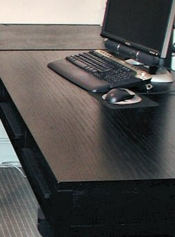
Months ago we talked about disguising large flat screen TVs. At the time I was concentrating on sourcing a mechanism which would allow the painting or panel concealing the screen to be lifted mechanically. Having sourced a couple of such mechanisms I moved on to planning the necessary prep work to the wall. Whether the item concealing the screen lifts/slides manually or through a motorised system, the fact remains that a number of issues need to be considered before installing the screen itself.
Your design for the wall will have to take into consideration, among other points:
Future proofing,*
allowing for extra power supplies,
ventilation,
access,
cable management**,
screen removal/replacement

* In plain English this means you should lay every type of cable you might need should you decide to add equipment to the system long after the initial installation; future proofing therefore means "allow for every possible cable, using the best possible quality, even if you are not connecting it to anything at the moment"
** This simply means you should plan to make it as easy as possible to connect your screen to new or additional equipment, the latter to the satellite dish, etc.; cable management therefore relates to the ease of access you have built into your cable routes.

The sketches below show my initial plan for one such wall. In that case we intended to conceal a Sky box in the wall, allow for DVDs to be stored on the open shelf under the screen and external speakers at high level as well as a base unit to be free standing on the floor.
Although working notes are not included in this post you will see from the coloured icons the areas I was drawing the client's attention to. These all relate to the points listed above.

The next sketch indicates the 3 areas where glass or stone or lacquered MDF could be used to complete the installation. In this case a DVD player was going to be installed in the room immediately behind the wall. As neither DVD player nor Sky box were going to be in plain view of the remote control infrared connectivity needed to be allowed for. This can easily be done either with a simple IR signal extender or with a slightly more specialized flush fitting "eye" manufactured for joinery work.

The simplest looking installation is often the hardest to achieve.

Tuesday, November 04, 2008

INTERIOR DESIGN DIRECTORY

There are a few sites we refer to when we quickly need to bring up details of all suppliers or manufacturers in any given field. One of these (probably the one listing the largest number of our favourite companies) is

Wednesday, October 29, 2008

OLD FAVOURITES: clean shapes for elegant furniture

When planning furniture layouts I find helpful to create a framework of simple, solid pieces. Clean shapes and good quality are the foundation of a design which will then allow "dressing up" or "down" with accessories. Here are some old favourites, furniture and upholstery design I revisit all the time given their versatile proportions:
Dark, nearly black, stained oak furniture with modernist inspired chunky detailing and proportions

Upholstery, unless you are designing an accent piece, benefits once again from clean shapes (whether including traditional scroll arms or 20th century square detailing)


The more detailed the piece the more crucial it becomes that quality is impeccable. If budget is an issue, simple choices always pay off.

Once a framework of smart pieces of furniture has been created... colour and accessories can be added.

It's a simple recipe but one that will allow future changes without too much disruption.


Tuesday, October 21, 2008

LIMITED FURNISHING BUDGET: no limit to good taste

If you are on a limited budget, whether furnishing a first time buyer's flat or a rental investment, the golden rule has to be "keep it simple". The lower the quality the more important it is to keep detail to a minimum. Where tables and worktops are concerned thicker depths often make items look more expensive. In an earlier post you saw a small kitchen designed for a rental flat. The following are some of the furnishing suggestions made for the same property. 
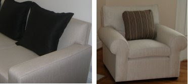
These should give an idea of how a limit on budget does not have to result in a limit on good taste. Stick to your "simplicity" rule across the board. When it comes to fabrics make plainess and budget inversely proportional: the smaller the first the plainer the second! See the board below: plain fabrics can be of a lesser quality and the difference will hardly be noticeable while patterned fabrics need to be better quality.
Compare this to a more complicated design. Take for instance one plublished months ago which included laquered side tables and a mother of pearl chest. Given the quality of those items the design was a success. On a smaller budget the lime green would probably have to be dropped and the overall number of colours decreased. The risk is that the room would otherwise look slightly amateurish.
(furniture and fabrics above, among others, from Dwell and Andrew Martin)

Saturday, October 11, 2008

ELECTRONIC PRESENTATIONS: basic cad design

A number of basic CAD programs are now available on the market. Most of them offer a reasonable alternative to those who do not need the intricacies (or the steep and lengthy learning curve) provided by AutoCad. Some of these packages come with reasonable 3D rendering built in. Usually the 3D visuals can be saved as images and therefore emailed to clients together with additional details. In other words... electronic presentations are now a reality within everybody's reach. Floor layouts, furniture, pretty much anything can be created on a laptop in a format that can then be either emailed of printed. The equivalent to traditional sketches and mood boards were, in this case, created using TurboCad and Paintshop Pro X. Below is an example which shows a standard rental flat kitchen solution together with a photograph of the suggested finishes. 
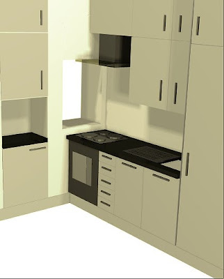
Through that sketch and photograph the client was able to agree the design and issue his instructions. 
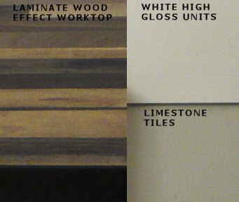
The kitchen, nearly completed, was photographed today. As you will see the simple 3D sketch was a very realistic, if simplified, visual indication of what was then actually fitted. This is now for us the standard way of making presentations, whether through printed or electronic versions of the same files.

Monday, October 06, 2008

LOSING THE INTERIOR DESIGN FORMULA: office furniture at home

We are refurbishing offices for the first time in years. As a result we have recently looked at various manufacturers and distributors of office furniture. The wealth of styles and qualities available on the market today allow for a number of "cross-over" permutations. Clearly office furniture can be used in studies or home-offices, but many boardroom tables will serve as wonderful dining tables and a number of sheleving solutions could be ideal for media rooms and home cinemas. Have a look around. You might like to start with Matteo Grassi's leather topped meeting table or Tecno's uncompromising clean shapes and proportions.

Tuesday, August 19, 2008

LOSING THE INTERIOR DESIGN FORMULA: in the kitchen

Interior design cyclically loses it's formula. And what inspiring times those are... Periods when high street and top end of the market designs all seem to strive for the same "look" are contrasted by phases during which interior design heads in multiple directions. The quest for the holy grail, a new and original union of practical and aesthetic concerns, is momentarily open on more fronts.

After a long period during which the UK looked to its European neighbours and actually saw them, the "minimalist formula" was found. Interior design in the 90s applied this formula at every opportunity. Over the last decade however British designers' confidence has grown. Furniture, fabrics, wall papers, just about all expressions of mainstream interior design appears to be searching for a new recipe. Lines are being softened, colour is embraced, pattern is no longer to be frowned upon, every expression of design is potentially acceptable.
This lack of an apparent formula does however confirm an underlying principle which is as valid for interior design today as ever before: the talented lead the way and manufacturers follow, albeit with a delay of a decade or two.
Take kitchen design: Johnny Grey has been producing kitchens like these for the last 3 decades or so. While the price tag falls miles outside the scope of most budgets the inspiration it provides is as cutting edge as it gets. The "soft geometry", the confident colour palette, the quirky references to familial comfort, this is the stuff that 2008/2009 interior design trends are made of!

Thursday, June 05, 2008

REFURBISHMENT & RESTORATION: historical buildings in the centre of Rome

In a city such as Rome a vast proportion of refurbishments take place within historical buildings. Obiously protected by conservation laws, these buildings are also safeguarded by the inborne love of historical detail present in most Italian architects. Interestingly, in Italian the words "refurbishment" and "restoration" have virtually idential meanings and there is a single translation for both terms: "restauro". The framework of each project is set by the historical value of the structure. This however in no way limits the immagination and capacity for experimentation of some young architects. While searching for a valid example of a small scale project to demostrate the work of young Roman architects I noticed this 60 sq m space developed into a studio by a young Roman architect, Carola Vannini. Here an old store space under the arches in Piazza Vittorio (in the area of Rome known as the Esquilino) has been restored with great understanding of past, present and world trends.

NO GLOBAL DESIGN: the italian connection


Prof. Morlacchi's work could not be more Roman and less globalised. After decades teaching architecture and conservation techiniques at the universities of Rome, Chieti and Pescara, Prof. Morlacchi has printed some of her painstakingly accurate surveys of the historical centre of Rome (available in various formats from approx. 50cm to 150cm wide). The problem? If you want one of these prints you'll have to write in for the address, find your way through Villa Borghese, up and down a hill and through a small gate. There you'll find her at work under overloaded shelves of drawings, sketches and prints. But you never know.... you might be able to mail her the cash (credit cards and cheques strictly out of the question).

Sunday, June 01, 2008

ID & ARCHITECTURE MAGAZINES: the Italian connection

While in Italy I thought I'd read every interior design magazine I could get my hands on. In the UK mags are basically available in two flavours: standard (indipendent publications) and free (i.e. distributed as integral part of a daily newspaper on a particular day of the week/month). In Italy there is a third variety, the semi-free mag. My favourite is distributed with "La Repubblica", which costs slightly more on the last Saturday of the month. Presumeably this allows the publication not to be entirely reliant on advertising and advertorials. Other daily newspapers publish interior design inserts and for some reason these appear to me more informative and up to speed than some of the standard Italian i.d. publications. Have a look at Repubblica's Casa&Design and ATCasa by Rizzoli Corriere della Sera. On a slightly more radical level, and involving a bigger commitment both in terms of time and money, you might prefer to acquaint yourself with Domus, The architecture and interior design magazine founded by Gio' Point in 1928 (or their website, also available in English). Taschen recently published a 12 volume collection covering the Domus years between 1928 and 1999.

Tuesday, April 29, 2008

COLOURS AND SHAPES: confident interior design

As new interior design trends emerge our level of confidence wains and, periodically, we tend to follow new, strict, unwritten rules. As we absorb and come to better understand new influences, we appear to gain the necessary confidence to break some of those rules. Over the last few years British interior design has become familiar with oriental influences, retro design, simplified structural detailing, subtler use of colour and overall cleaner lines. This new "language" of design has now become so familiar that many designers are attempting slightly richer combinations.
While leafing through an old copy of Architectural Digest (Italy, Jan 2008) I came across a photograph which illustrates this approach. Interestingly however, the project belongs to a design firm based in Brescia (Angelo Brignolli and Antonio Feraboli of Studio Linea) whose background, judging by their online portfolio, is very different to that of their UK counterparts. Most of their projects appear routed in the history of Italian architecture and furniture design and executed in conpemporary style. In the bedroom shown above the predominance of clean lines and good proportions allow the designers to play with colour and softened shapes. Ethnic influences are interpreted, not slavishly obeyed. The resulting elegance in no way forfeits comfort or warmth: an interesting example of contemporary UK design from Italian designers! There are obviously many routes one can follow to competent design...

BATHROOM DESIGN: practicalities vs aesthetics


Bathroom design has changed dramatically in the UK over the last 20 years. Whereas the clean minimal look may not survive indefinitely, I doubt we will return to unhygienic fitted carpets or the “country” look any time soon. Most good decisions in interior design represent a compromise between being sensible and being fashion conscious. With bathroom design the sensible part of the equation lies with the choice of non-absorbent materials and uncluttered spaces, all of which area easier to keep clean. The fashion conscious portion of the equation relates primarily to shapes and sizes. There is in fact no other reasonable explanation as to why I can’t remember the last time I selected a 10x10cm ceramic tile, nor can I remember the last client who insisted on raised and fielded panels for their vanity unit doors. The sensible part of the equation, in this day and age, should involve us looking at waterproof membranes for shower enclosures (something which is far from standard in the UK). The fashion part involves our keeping track of the more subtle changes: basins for instance have gone from the square pedestal (with lethal pillar taps dispensing either scorching hot or freezing cold water) through the “free standing bowl phase” and onto the square look with “attitude”.
There are a number of buzz words in interior design. They change with time and depending on which part of the home you are addressing. One of those words is “wet room”. Everybody wants the wet room look and by that they mean the absence of a shower tray and a step onto the showering platform. Without getting too technical, it is clear to anybody who stops to think about it that a wet room is only possible if the shower’s waste pipe can be angled to guarantee efficient drainage. This, in many houses and flats, is simply not possible. Shower manufacturers have taken note of the demand and started producing a number of trays which try to guarantee both looks and efficiency. Not as easy as it sounds: shallower trays allow less overflow tolerance and less access for maintenance and inspections. As ever, a good compromise between practicalities and aesthetics is not easy to reach. Peter the contractor’s advice is: start by working out where your pipes need to be and how you will conceal them and then choose your sanitary ware and taps.
Practicalities however are not as much fun as design. So: have a look at the Duravit website for the latest on sanitary ware, Crosswater for taps, Hansgrohe for showers and CP Hart if you want to have a stroll through a virtual retail showroom.

Wednesday, April 09, 2008

FURNISHING AT STARK'S: lucite & the age of jazz

Pick up a copy of Architectural Digest online if you have moment to spare. Stark's Manhattan's showroom must be worth a visit... especially so if you are inspired by the 30s and 40s and keen on Lucite!

Tuesday, April 08, 2008

FLOORBOARDS: to stain, oil or varnish?

Wooden floors have become extremely popular. The trend moves towards ever wider boards, either engineered or solid. In terms of colour, light oak used to be all the rage until wenge became hugely trendy where furniture is concerned and the general taste in wooden floors followed suite, darkening. Even restricting one’s choices to oak, the old favourite, a number of important decisions remain to be made: namely colour and type of finish. Any type of wood can be tinted, darkening is easiest (through stains) while lightening can only be achieved through liming and similar procedures. My personal preference is to either select a wood I like in its natural state or to opt for a smoked finish. An oak onto which a very dark stain has been applied will reveal its original colour when scratched or dented and this will make the damage considerably harder to repair.
Once an exact shade has been agreed upon you will need to select a way of sealing it and protecting the board from traffic. The choice is between polyurethane varnishes and oils (or waxes). The first has to be applied by a specialist who will sand the entire floor and seal it with a number of coats. Ongoing maintenance of this type of finish is easier (just wash with a soft cloth) but damage cannot be rectified without the intervention of a professional who will once again sand the entire floor and re-varnish it. Oils and waxes require more maintenance (oil needs to be re-applied every few months during the first year and twice a year thereafter in my experience). However, oil is a much more forgiving finish. Should the floor become scratched or dented it is possible to lightly stain the scratch (I have successfully used boot polish in some instances) and re-seal it. Oiling a single floorboard is in fact possible and this, in cases of minor damage, is a much more viable solution.
The bottom line is that there is no bottom line with wooden floor finishes. As with most interior design related issues the decision should be made on the basis of how the property will be used. With a rental property for instance I would
- avoid a brushed finish (as the roughness imparted to the board through brushing would be removed by the sanding machine during maintenance work),
- select an oiled finish for short lets (so as to avoid costly maintenance every few months), avoid a limed finish, which shows “traffic tracks” in the most used areas.
As ever, a list of your top priorities needs to be your starting point. Gain some knowledge of products available and find the best compromise between the benefits and drawbacks that come with them. I can’t stop saying it: interior design is as much the art of excellence as it is of compromise!

Monday, April 07, 2008

SASH WINDOWS: sound insulation possible?

If traditional sash windows are the only barrier between us and London traffic we might be able to tackle the problem simply by improving or installing draught seals. As well as draughts, these seals also reduce airborne noises which find their way through the smallest and least noticeable gap.
If the problem persists one might be tempted to consider secondary glazing. Effective as this solution may be, the “aesthetic” compromises it implies often mean it is not a viable solution. If secondary glazing is not an option the sash window glazing needs to be addressed. This will need to be upgraded to a “sealed unit”, i.e. two sheets of glass sealed on all fours sides and installed, in the case of sash windows, within the sash bars. One of the sheets of glass used is often an acoustic glass. There are many types of acoustic glass, available in various thicknesses (4.4mm to 12.8mm in terms of window glazing) and designed to control various levels and types of noise. Developed and tested by the larger glass manufacturers (e.g.
Pilkington Glass) the results are often not as impressive in real life situations as they may be on paper. Noise travels in waves on varying frequencies. Sound insulating materials attempt to control noise by disrupting the flow of these waves. Every time the wave passes through a barrier it is diminished and the shape of the wave is altered. Acoustic (laminated) glass is comprised of 2 or more layers, laminated together with a special film separating the layers. As the sound wave passes through each layer it is diminished: the thicker the sheet the more effective in breaking down the sound.
Here comes the inevitable compromise: as the glass gets thicker it also becomes heavier and so the weights used to raise the traditional box sash window will have to be increased accordingly. More weights will result in less room to move within the box itself and the window will therefore become less functional: the weights will have nowhere to slide and one of the sashes will effectively become fixed.
The “art” of compromise is therefore based on understanding. Sound insulation is probably best achieved via well fitted windows with good draught strips, laminated safety glass 4.4mm or 6.4 mm thick may not be quite as acoustically efficient as the best specialist glass but, at a fraction of the price, it will dramatically assist in an overall noise reduction plan.

Friday, April 04, 2008

PAINT: not as easy as it sounds

Over the last decade paint has become the finish of choice for most designers. "Off-white" has become the password when it comes to decorating. The market has moulded itself around the increase in demand and every manufacturer has created extensive ranges of lightly saturated colours. As the collective preference for lighter colours developed so did the "designer paint" market. A three tier market seems to be the result. Purely based on price, paints seem to fall into three broad categories: standard, designer and specialist. Nothing strange there. What might be surprising is how difficult it can be to select an off-white, even an extremely white off white! That's where I find quality pays off. You can spend a fortune, both in money and time, going backwards and forwards collecting samples and applying them to the wall. You can spend even more time finding out that the colour may be exactly what you wanted but the texture and lasting qualities of the paint you purchased are not up to scratch. That's when you might discover that there is a place and price worth paying for good paint and, above all, expert advice. After searching high and low for an off-white which wouldn't err on the side of pink or yellow, I discovered the expert advice of Papers & Paints. If you live outside London I am sure there must be an "old-fashioned" advice based paint specialist near you. In shops such as these you may be paying extra per gallon but if you ask the right questions you’ll be given the answers you need. I am not sure what it is in the actual makeup of paint but the best manufacturers certainly seem to succeed in avoiding crude and cheap-looking colours. Even where the more vivid hues are concerned a certain elegance is present in most colours of most top-end of the market paint collections. Is it the raw materials? Is it the research behind the formulas? While many paint shops maintain they can "scan and mix" any colour by any manufacturer in their own paint (i.e. using the paint they sell) I wouldn't bank on it looking like the “original”. There will be exceptions but think of how the same concept works in the world of fashion… There is a place for the imitation and one for the original. My standard recommendations from Papers & Paints never disappoint (see samples and application - above).

Wednesday, March 12, 2008

DOORS & WINDOWS: back to basics

Successful interior design needs to be based on the "skin and bones" of a house. The structure, fixtures and fittings are often left unquestioned. These subconsciously but immediately inform our initial perception of our surroundings. On a more practical level, a hollow poorly fitted door provides little sound insulation just as an inexpensive or badly maintained window causes the same problem as well as allowing heat loss.
I work mainly on listed buildings and properties within conservation areas where the replacement of windows usually has to be implemented on a strictly like-for-like basis (i.e. timber for timber, sash for sash, with allowances made for modern sealed glazing units). There are many firms out there offering the benefits of sealed glazed units applied to traditional timber window designs. Having spotted their "conservation range" I recently contacted Mumford & Wood who are assisting me with the planned replacement of Georgian style sash windows. I will post once "before & after" comparisons are available.

Where doors are concerned there is often more scope for choice as the rules are somewhat less stringent (in non-listed buildings of course). In an ideal world no expense would be spared. If the budget allows for this I would not hesitate in contacting Longden whose doors grace many of the top developments in central London.
Should the budget only stretch as far as an improvement, I would at least consider solid paneled doors, oak if possible (in spite of the tradition for pine where painted doors are being specified). As always, when savings have to be made, one's understanding of doors will be tested far more than it would be if the made-to-measure route were an option:
1. the sizes of existing door openings will dictate whether standard sizes will fit;
2. some doors will more than likely have to be fire rated and sourcing these to match the style of the non rated doors is not quite as easy as it sounds;
3. as a result a combination of made-to-measure and standard sizes often ends up being the only possible way forward.

So what do all these different types of doors cost?
One shortcut to the answer is provided by this table available on the GreenSpec web site. The purpose of the table is to assess the cost of each type of door and its maintenance over a 60 year period and therefore needs to beread with its scope in mind. The background research provides however, at the time of writing, a good indication of how much each door will cost you (although fitting and decorating costs have probably undoubtedly increased since).

Wednesday, February 27, 2008

LARGE FLAT SCREEN TV: an alternative to monopolizing living rooms

Many of us feel slightly uncomfortable at the thought of a "loads of inches" plasma/LCD TV as the focal point of our living room. Even more so when it usurps the very spot traditionally reserved to one's favourite mirror or painting, above the fireplace.
At the cost of sounding like a broken record, interior design is - among other things - the art of compromise. The clever people at AUTON in California provide us with just the compromise for our TV conundrum. Want a big screen and have nowhere to put it other than above the fireplace BUT don't want a plasma taking over your living room? Hide it! say the people at Auton. Other companies have reached that conclusion in the past and effective mirror fronts have been created for the purpose. This solution however looks at home in an up market bathroom or in a high tech office. In a living room a painting or a large photograph may look more at home. This can be achieved with a completely custom made solution but, as of 2006, Auton's Shadow Trak and the In-vis-o-trak provide a much cleaner solution. Ask your designer to contact Auton direct (as they have no distributors in the UK at the time of writing). Also, ensure your building contractor has been correctly instructed as to how to prepare the wall or chimney breast on which the track will be fitted.